Birch Coffee
App Redesign
App Redesign

My Role: UX&UI | Motion Graphic Design | Illustration | Branding
Duration: February 2021 – May 2021
BRIEF
During the COVID pandemic, many people started to use mobile application to place their orders for their own safety. However, this caused some inconvenience compared to ordering in person.
This is why we decided to tackle this project: to make it not only convenient for users during the pandemic, but also to redesign the functionality of the interface itself. To bring the happiness of having a coffee back to life during the pandemic.
APPROACH
I followed a three-step process that combines research, strategy, and design for the Birch Coffee app redesign. Through research, I gained a solid understanding of the user and pinpointed important design problems to solve. I simplified my findings throughout the strategy phase into a distinct design objective that directed the design process. I sketched and modified a lot during the design phase to create a cutting-edge, user-friendly app that addressed user pain points and encouraged user engagement.
OUTCOME
This project resulted in a revamped Birch Coffee app that provides a better user experience, increased user engagement, higher user satisfaction, and good brand awareness, all while gaining skills in mobile app development, user research, and design thinking.
EARLY INSIGHTS FROM THE FILEDS
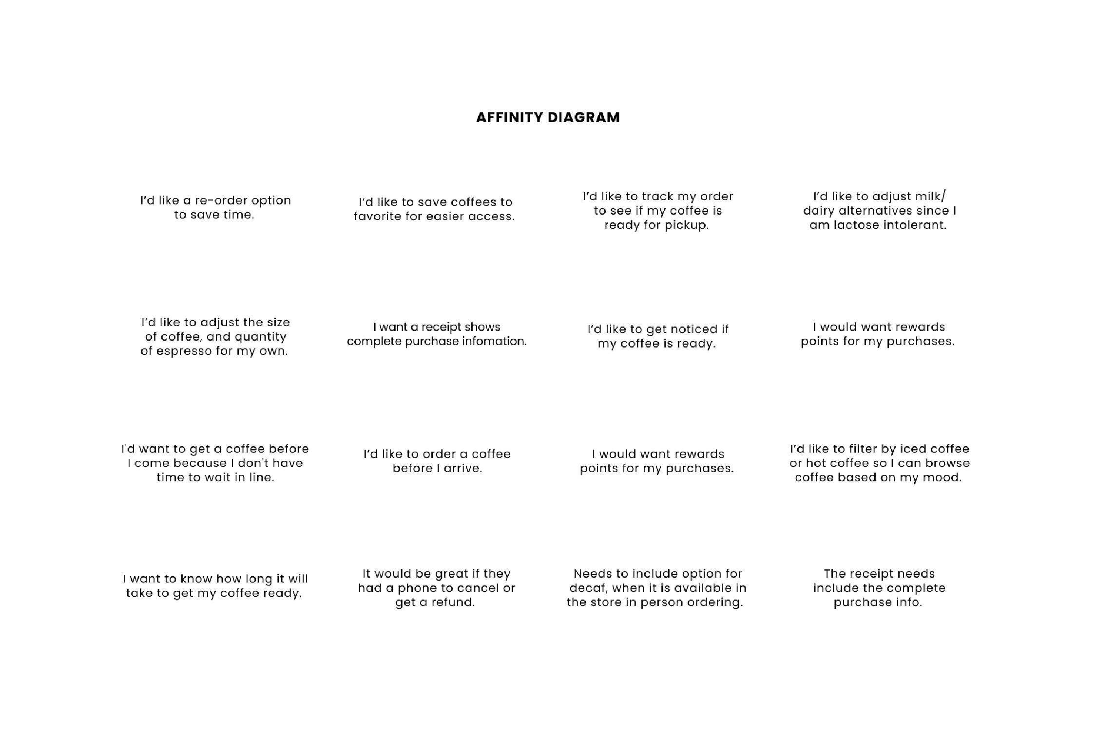
I sifted through hundreds of reviews and comments left by
users on the Apple store, and further categorized them under brackets. This was
some crucial feedback that helped me identify various pain points and areas of
improvement. In additional through the user interview, I learned about the
experience and problems of users using the app —— from ordering a coffee to receiving
their coffee.
Needs more customize options:
Users were frustrated that when their options are not in the custom options, they had to spend extra time communicating with the barista, which defeated the purpose of ordering ahead to save time and effort while maintaining
social distance.
Users were frustrated that when their options are not in the custom options, they had to spend extra time communicating with the barista, which defeated the purpose of ordering ahead to save time and effort while maintaining
social distance.
No order tracking system:
Most users also want the capability to track their coffee as they find it annoying to cross the crowded counter during morning rush hour to check on the progress of their coffee.
Most users also want the capability to track their coffee as they find it annoying to cross the crowded counter during morning rush hour to check on the progress of their coffee.
Lack order management functionality:
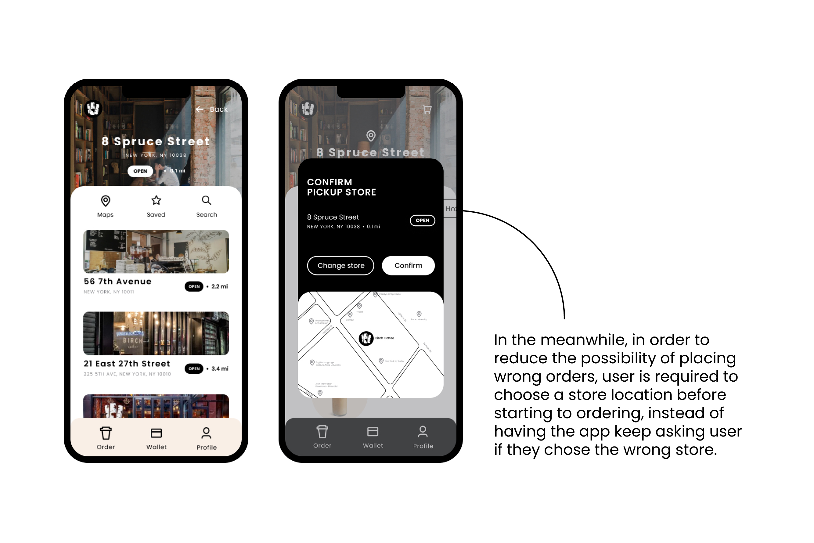
Users want easily to access their order information from active to past. They also want to be able to manage their order on application. Both users and coffee shop owner can be upset if users accidentally place an order at the wrong address or place an order they do not want.
Users want easily to access their order information from active to past. They also want to be able to manage their order on application. Both users and coffee shop owner can be upset if users accidentally place an order at the wrong address or place an order they do not want.
THE DISCOVER
The problems we found did not surprise me. Ordering coffee
is a simple but important part of most people's lives; it can be a fresh start
that sets the tone for the rest of the day. After some consideration, it became
clear that users expected the experience to work with little effort. During the
Pandemic, users became more acclimated to dealing with everything through their
cell phone.
Our high-level goals were to:
1. Make it straightforward,
and easy to use for everyone.
2. Give users more control
over their orders and time.
3. Create a platform to make
it smoother for users to manage their orders.
Before we could jump into designing, we wanted to understand common challenges users face trying to order a coffee and finally receive their coffee, especially during the pandemic. In order to possess a better understanding of their behaviors and motivations, some of the learning from user review on Apple store and user interview.

DEEPER INSIGHTS
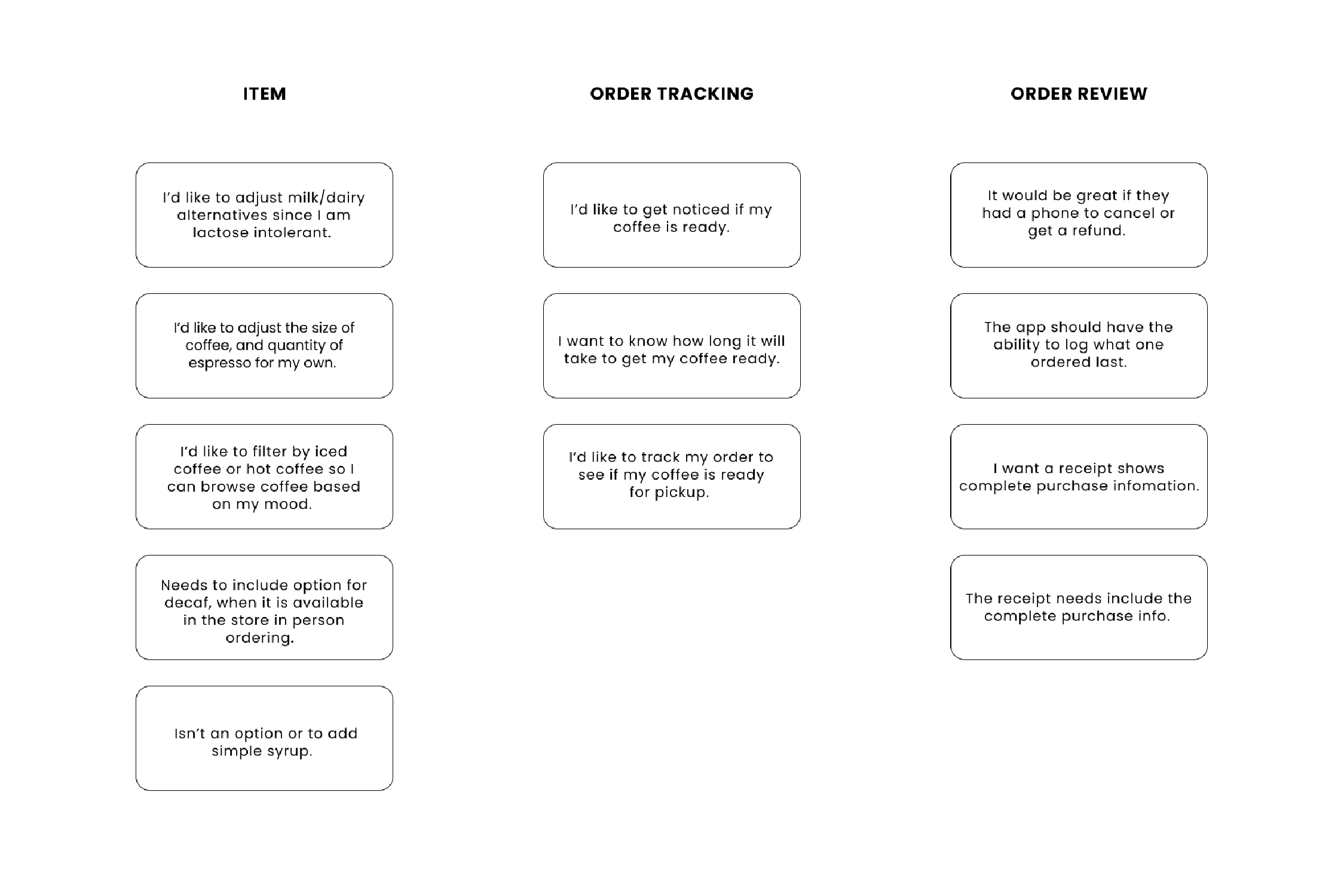
Basic on research, we choose three main points what need to
be addressed most, and to create user flow and wireframe to work with.
The three points are:
1. Lack of Customization
options
2. Inability to track orders
3. Incapability in managing
active or previous orders.
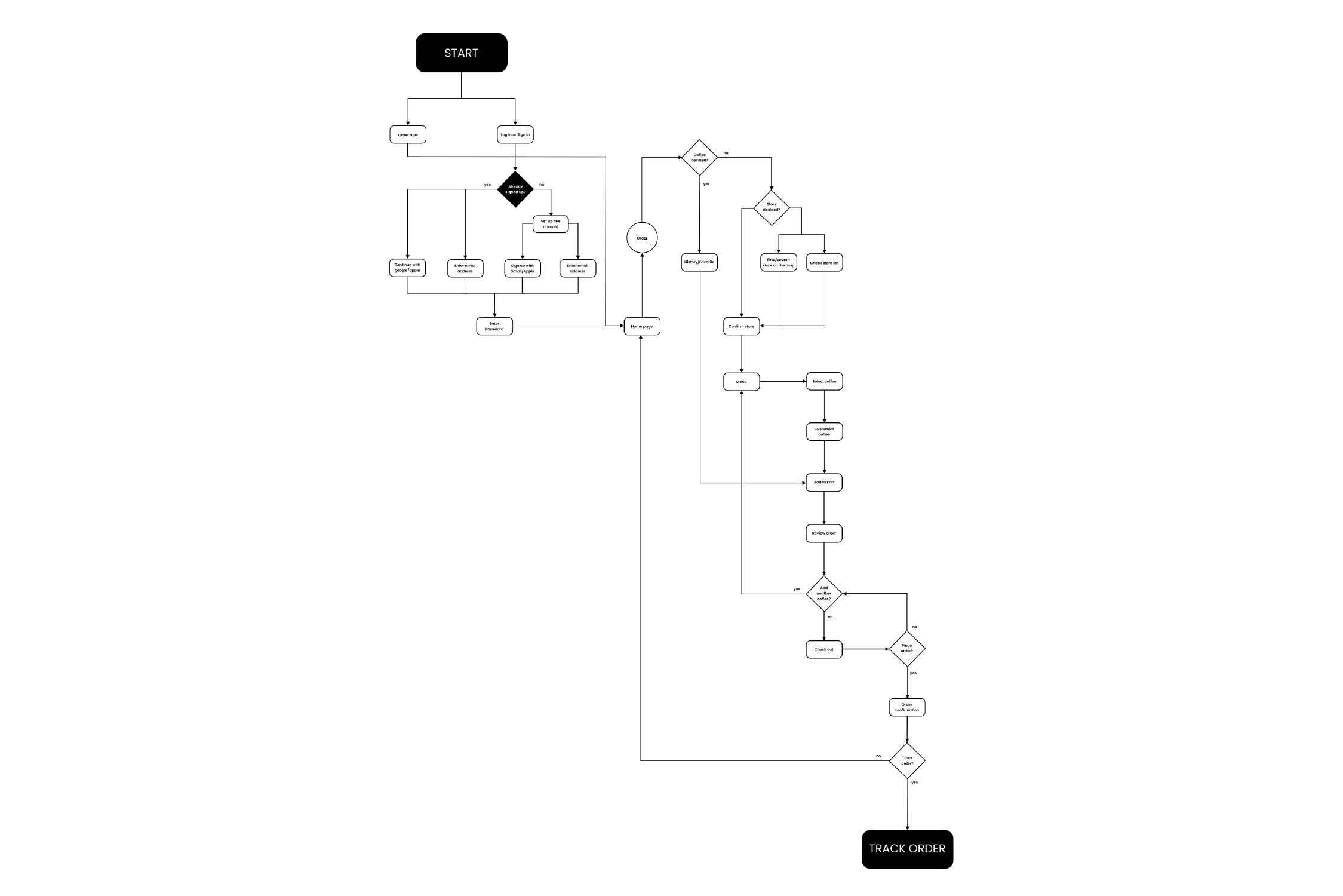
Low-Fidelity Prototypes
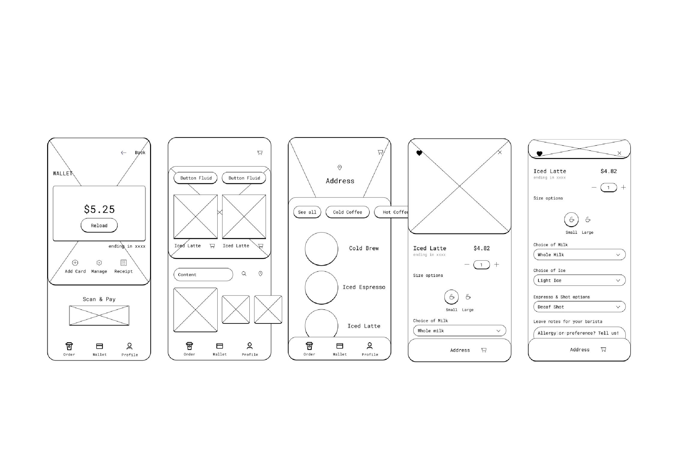
After the setting of project goals and scope, we created
low-fidelity prototypes to explore and evaluate potential design possibilities.
This process enabled us to engage in think brainstorming and think outside the
box early in the design process, highlighting potential problems for
improvement. We were able to swiftly iterate and develop our design concepts by
utilizing low-fidelity prototypes, resulting in a more robust and effective
final product.

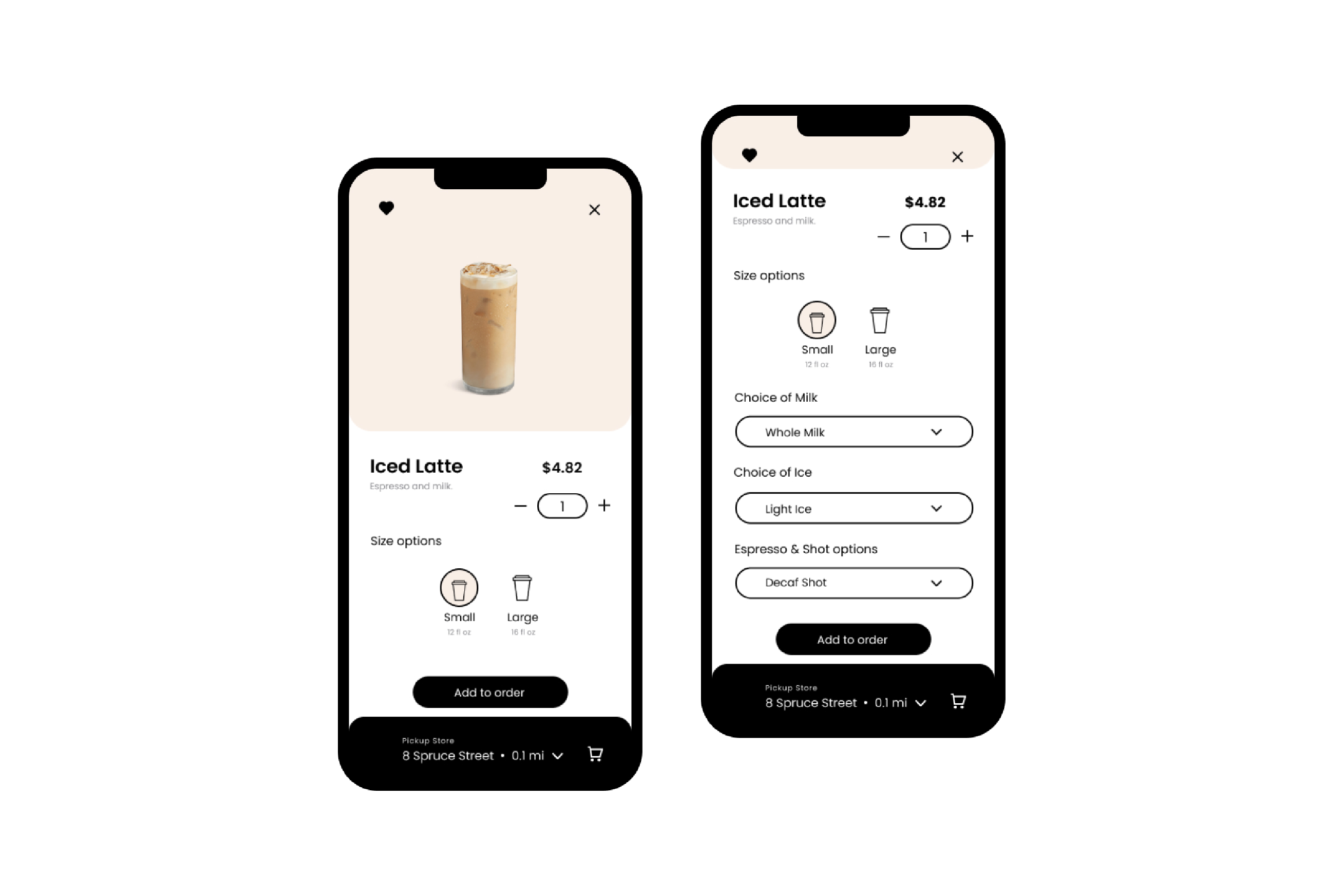
Feature #1 Customization
The coffee ordering app offers users the ability to customize their coffee orders by selecting and adjusting options such as milk, ice, and the number of espresso shots. To provide an intuitive and user-friendly customization experience, I drew inspiration from restaurant reservation systems, which allow customers to leave notes for chefs about their special requirements.

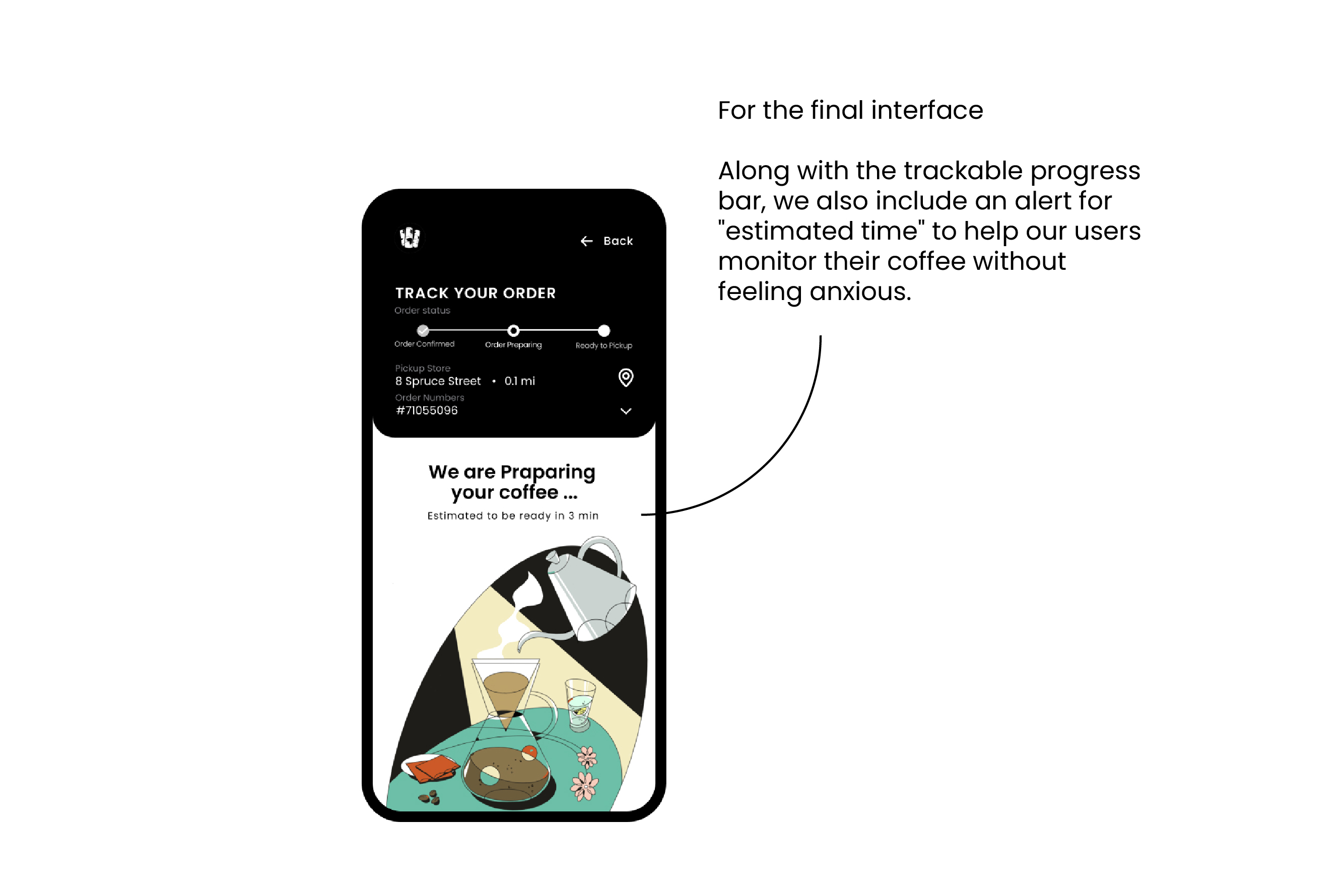
Feature #2 Order Tracking
Users can follow their orders on the app and be notified when their coffee is ready for pickup, which cuts down on waiting and anxiety. We offer time ranges for customers to choose from so they can pick up their coffee and go, giving them more control over their time. This function promotes social distance and prevents overcommunicating, saving time and assuring everyone's safety.


Feature #3 History / Receipt
The app allows users to access their past and current orders, making it easy to re-order and manage their orders. To prevent incorrect orders, we explored various options and found that using a confirmation page to remind users to double-check their order location was the most effective method. This method also utilizes the store name and map to help users quickly identify the correct store.

